The Brief
What
Private Media runs four mastheads — Crikey, The Mandarin, SmartCompany, and Inc. Australia — each with its own audience, tone, and commercial model. The brief was to lift the UX across all four to meet current reader expectations, reduce friction in subscription flows, and build a shared pattern library that lets each publication move fast without reinventing the wheel.
User
Mobile-first Australian news readers — checking headlines on a commute, following specific columnists, expecting the same frictionless experience they get from mainstream apps. Research conducted with 16 mobile users based across Australia.
Potential Challenges
Four publications with divergent design languages — a unified system had to feel coherent without flattening brand identity
Legacy CMS infrastructure with limited front-end flexibility, constraining what could be templated
Any design decision had to scale across multiple live editorial sites without disrupting daily publishing
Subscription and paywall flows built at different times, with no consistent logic across publications
Pattern library needed to serve both design and development teams with different tooling and workflows
Objectives & Goals
Revamp the UX across all four publications to meet 2024 reader expectations — not just aesthetic updates.
Deliver a mobile-optimised experience across every template: homepage, article, category, search, and account.
Reduce friction in the subscription and checkout flow to support commercial growth targets.
Build a scalable design system that works across publications without sacrificing brand differentiation.
Standardise components and interaction patterns in a shared pattern library for both design and engineering.
User Needs
Get to relevant content fast — without scrolling through noise.
Search that anticipates what you're looking for before finishing the query.
Browse by topic or section without losing the thread of what's relevant.
Create a free account without hitting a hard paywall as the first interaction.
Set reading preferences so the homepage reflects the content that actually matters.
Subscribe and complete checkout without re-entering details or hitting dead ends.
A reading experience that works with a screen reader and doesn't break on accessibility tools.
Key Questions
- 01
What news apps or publications do you use regularly, and what keeps you coming back?
- 02
Walk me through how you typically browse — do you start on the homepage, or come through search?
- 03
How do you find content on a topic you care about? What does that process actually look like?
- 04
Have you ever started a subscription and abandoned it? What stopped you?
- 05
How often do you hit a paywall, and what do you do when you do?
- 06
What's the most frustrating part of reading news on your phone?
- 07
If you could change one thing about how these publications work on mobile, what would it be?
Competitor Analysis
Four major digital mastheads were benchmarked against Private Media's publications — mapping where the market had raised the bar and where the opportunity to lead remained.
The Guardian Australia
Quality / IndependentStrengths
Contribution model removes the emotional friction of a hard paywall
Mobile-first reading experience — clean typography, minimal ad interruption
Columnist visibility and follow mechanics drive repeat engagement
Accessible navigation with predictable category structure
Weaknesses
Less category depth than commercial rivals — content can feel narrow
Subscription CTAs repeat across long articles and can feel persistent
Takeaway
The contribution model lowers the barrier to subscription without sacrificing revenue. Decoupling the ask from the hard paywall was a design principle taken directly from this benchmark.
Sydney Morning Herald / Nine Digital
Legacy MastheadStrengths
Large article library with deep category architecture
Columnist profiles and bylines drive repeat visits
Search surfaces archive content — not just recent articles
Weaknesses
Heavy ad load disrupts reading experience, especially on mobile
Homepage feels cluttered — hierarchy is hard to parse at speed
Newsletter management buried deep in account settings
Takeaway
Category pages and columnist content are high-value retention tools — confirmed the priority placed on both in the pattern library. Newsletter discoverability became a direct fix.
The Australian / News Corp
Business / PoliticalStrengths
Clear subscription value proposition on pricing and plans page
Consistent desktop experience across all sections
Strong political and business coverage for a loyal audience
Weaknesses
Mobile UX is dated by 2023 standards — layouts feel ported from desktop
Hard paywall triggers at very shallow scroll depth, causing high bounce
Account creation is tightly coupled to subscription — friction at both steps
Takeaway
Hard paywall at shallow scroll equals high bounce. Decoupling account creation from the subscription flow was a direct response to this pattern.
ABC News
Public BroadcastStrengths
The benchmark for mobile readability and accessibility across all Australian news
Clean typography and whitespace — fast to scan on a small screen
No paywall friction — sets a high bar for perceived content value
Weaknesses
No subscription, personalisation, or columnist follow mechanics
Limited account functionality — no preference management
Takeaway
ABC set the accessibility and readability baseline that the pattern library had to meet or exceed on mobile. Every article template was checked against this benchmark.
Key Insights
Paywall placement is the single biggest conversion friction point — the depth of first trigger matters more than the messaging
Columnist content drives repeat visits, yet no competitor had a strong columnist-follow mechanic — this was identified as a differentiation opportunity
Decoupling account creation from subscription consistently improves funnel completion across the competitive set
Mobile typography and ad load density are the two most cited pain points — both within design's control to address
Lo-Fidelity Wireframes
Homepage
Columnist Section
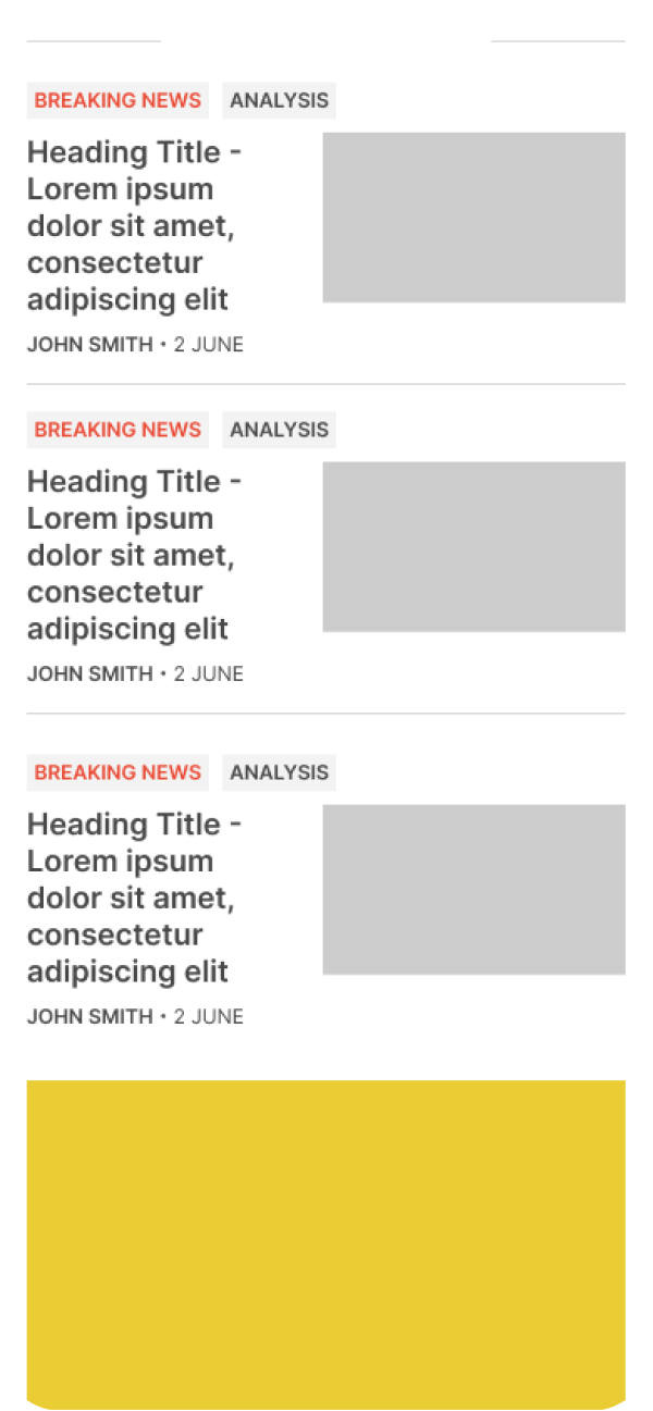
Article Listing
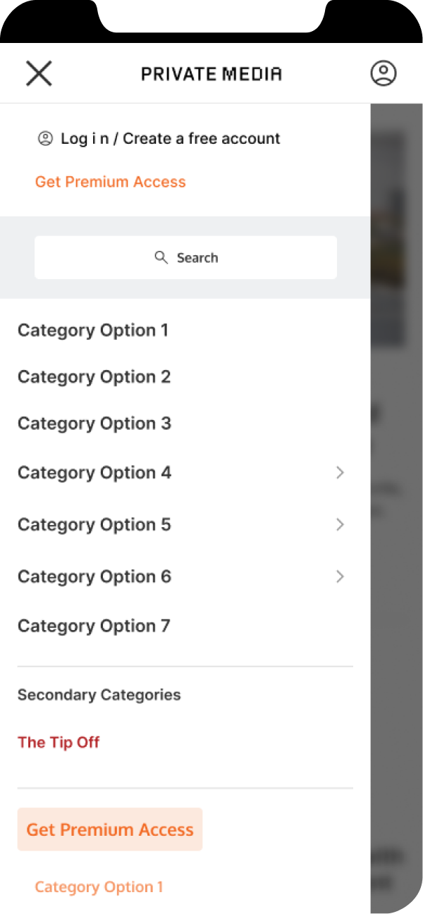
Navigation Menu
Category Article List
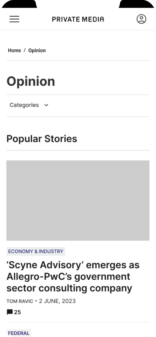
Opinion & Category Page
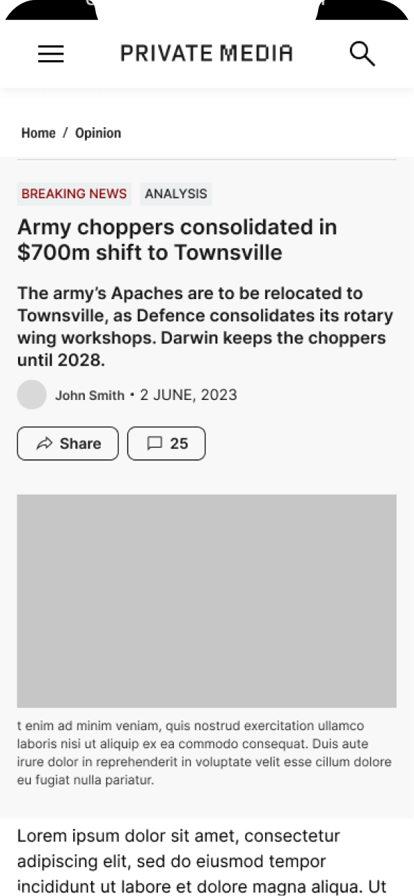
Article Detail
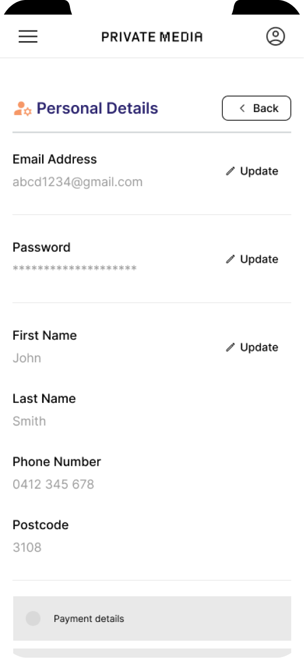
Account — Personal Details
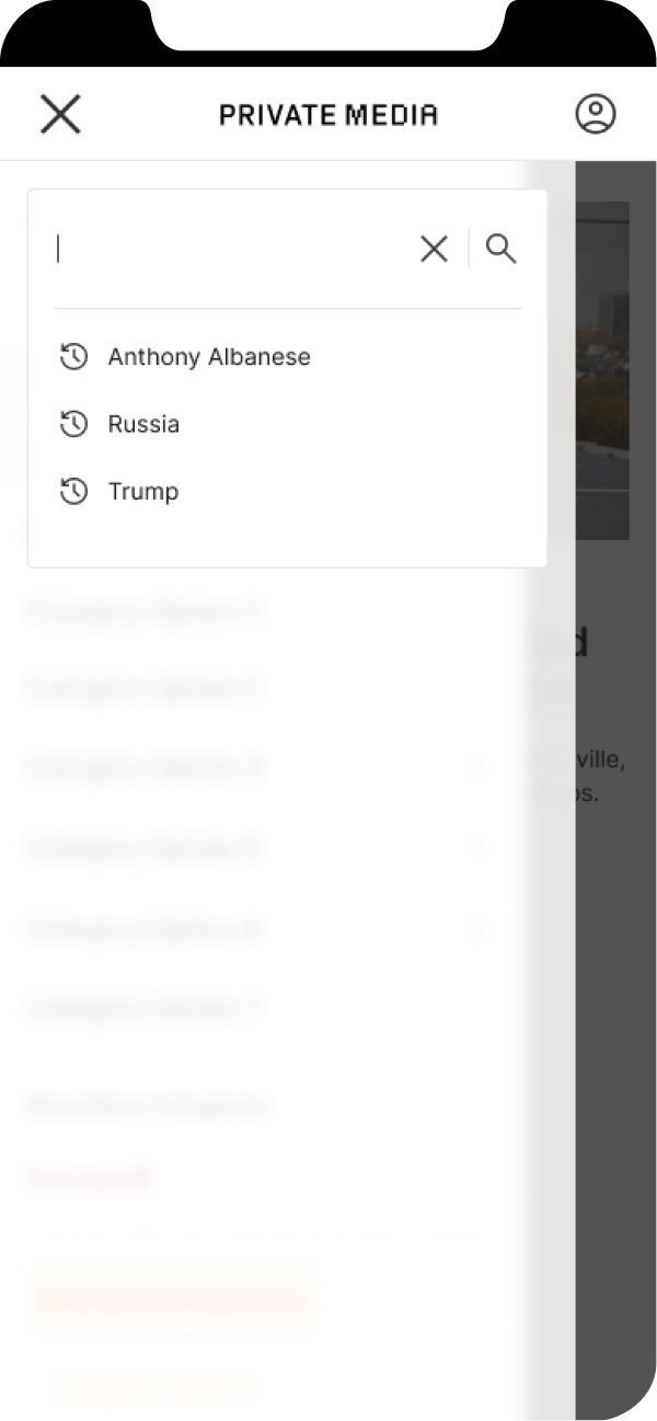
Search
User Testing
Moderated usability testing conducted with 16 mobile users across Australia — a mix of existing Private Media subscribers and readers who had never subscribed. Sessions were recorded and analysed across five structured tasks.
Method
Moderated usability testing (think-aloud protocol)
Participants
16 mobile users — 8 existing subscribers, 8 lapsed or non-subscribers — across Melbourne, Sydney, and Brisbane
Duration
45–60 minutes per session
Tasks
- 01
Find an article on a topic you care about using the search bar
- 02
Navigate to the opinion section and find a columnist you'd want to follow
- 03
Create a free account without committing to a subscription
- 04
Complete a subscription checkout for the plan that suits you best
- 05
Update your newsletter preferences from your account dashboard
Testing Feedback
Patterns surfaced from 16 moderated sessions — findings that directly shaped the final design decisions across search, paywall placement, and account flows.
What Worked
Navigation hierarchy required no prompting — 14 of 16 users found category sections without guidance
Columnist profiles drove stronger engagement than anticipated — 12 of 16 users explored columnist content beyond the assigned task
Free account creation completed successfully by 14 of 16 participants — clear visual separation from the subscription flow was the deciding factor
Mobile article reading experience rated positively across all sessions — typography scale and line length specifically cited
What Needed Work
Predictive search results appeared too slowly — 9 of 16 users abandoned the search input before results loaded
Paywall message triggered too early in article scroll — described as feeling 'baited and switched' by multiple participants
Subscription pricing page lacked clear tier differentiation — most users couldn't identify the right plan without assistance
Newsletter preferences were impossible to locate unaided — 8 of 16 users failed to complete the task
Key Insight
The biggest barrier to subscription wasn't price — it was unclear value communication at the moment of decision. Users didn't understand what they'd get that they weren't already getting for free. The redesigned pricing page addresses this directly.
Detailed Design
High-fidelity screens across The Mandarin and SmartCompany — covering the key reader and subscriber journeys. Designs reflect publication-specific branding applied within the shared pattern library. Screens shown represent The Mandarin and SmartCompany; the pattern library was applied across all four mastheads.
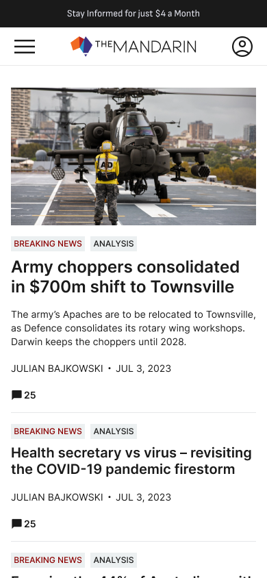
Homepage — The Mandarin
Hero-led homepage with editorial hierarchy. Columnist profiles and category navigation above the fold — built from pattern library components, reskinned for The Mandarin's brand.
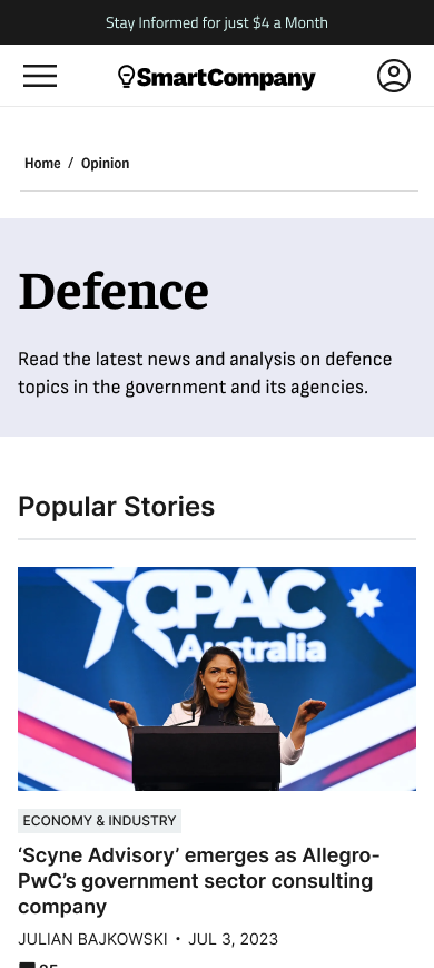
Article Page — SmartCompany
Article template with structured metadata, inline CTAs, and paywall positioning. Reading experience optimised for long-form business journalism on mobile.
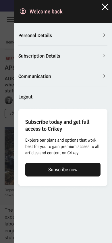
Subscription & Account
Subscriber dashboard with plan details and account controls. Account status and renewal date visible without digging through settings.
Profile — SmartCompany
Reader profile with content preference controls and newsletter management. One place to manage the full subscription relationship.
Design Strengths
Pattern library approach means changes propagate across all four publications — one update, four sites
Mobile-first templates cover every core reader journey: browse, search, read, subscribe, manage account
Publication-level theming preserves brand differentiation without requiring separate component sets
Subscription flow redesign directly addresses the drop-off points identified in user research
Accessibility baked into the component spec from the start — not retrofitted after sign-off
Open Considerations
CMS integration constraints may limit how dynamically some components can be populated in production
Content preference controls depend on a personalisation backend not yet scoped at time of design
Paywall placement logic varies by publication — needs a unified ruleset before development handoff
Pattern library governance (ownership, versioning, deprecation) needs defining before the dev team adopts it
Checkout flow tested on standard subscription tiers — gift and corporate subscription edge cases not yet covered
Next Case Study