The Brief
What
Target Australia's app product listing page was built for the web era — dense layouts, small product cards, buried filters, and no native mobile interactions. The brief was to redesign the PLP to match how Australians actually shop on their phones: faster browsing, smarter filtering, and enough product context to make a decision without tapping into every item individually.
User
Mobile shoppers scanning the Target Australia app across categories — checking size availability, comparing prices, and deciding whether something is worth a closer look. Often browsing on the go, with limited patience for extra taps.
Potential Challenges
Important product details — size, material, availability — required extra taps to surface, creating hesitation at the point of decision
Filters and sorting options were buried or unclear, reducing the time users spent engaging with the listing page
An overloaded layout made it harder for users to focus on products rather than the interface around them
Development and technology constraints shaped which native mobile interactions could be introduced within scope
A single PLP template had to hold across Target's full catalogue — clothing, homewares, electronics, and groceries
Objectives & Goals
Simplify the PLP layout so browsing, comparing, and filtering products requires fewer taps and less cognitive load.
Surface price, size, and availability at the listing level — so users can decide without drilling into individual product pages.
Introduce native mobile interactions: swipe-through images, quick add to cart, and a slide-out filter panel.
Add personalised product recommendations to reduce navigation paralysis and help users discover relevant items.
Design a scalable template that holds across Target's full product catalogue — not just fashion.
User Needs
Efficient browsing and filtering to find what they want without losing their place in the list
Product details — price, size, availability — visible at a glance without tapping into each item
Fast load times and smooth interactions on mobile — the same standard they expect from other shopping apps
Product recommendations based on their browsing patterns — not generic or irrelevant suggestions
Clear size options and real-time stock updates, so they don't add something to cart that isn't available
Quick visibility of trending items, deals, and new arrivals without needing to sort manually
Key Questions
- 01
How do you typically start looking for something on a shopping app — search first, or browse by category?
- 02
Walk me through the last time you used a filter on a product listing. What were you trying to do, and did it work?
- 03
When you're scanning products on your phone, what information do you need to decide whether something is worth tapping into?
- 04
Have you ever added something to your cart directly from a listing page without going into the product detail? What made that possible?
- 05
What frustrates you most about browsing products on mobile — too many steps, not enough information, or something else?
- 06
If you find something you like but you're not sure about the size, what do you do?
- 07
How useful is seeing similar or recommended products while browsing? Does it help you discover things, or does it distract?
Competitor Analysis
Four retailers were benchmarked across browsing, filtering, product detail surfacing, and mobile interaction — mapping the standard that Target's PLP needed to meet or exceed.
ASOS
Global FashionStrengths
PLP handles easy scrolling and quick filtering — the experience holds even across a catalogue of thousands of SKUs
Personalised product suggestions appear at listing level based on browsing history — before users have searched for anything
Weaknesses
Navigation can feel overwhelming for users not specifically looking for fashion
Mobile filtering requires multiple taps — not a native-feeling interaction on iOS or Android
Takeaway
Personalisation at listing level reduces discovery friction — users land on products that already match their history, meaning less browsing depth needed to find something relevant.
H&M
High Street FashionStrengths
Easily accessible size guides reduce hesitation before opening a product detail page
Clear colour swatches with easy toggling between sizes and styles directly at listing level
Weaknesses
Product card images are small on mobile, requiring zoom or a tap into the PDP to assess quality
Filter panel interaction is not always predictably dismissable — causes confusion mid-session
Takeaway
Size confidence at listing level is a direct conversion driver — surfacing size and colour on the card removes the main reason users tap away without adding to cart.
Cotton On
Australian RetailStrengths
PLP is highly responsive and consistent across device sizes — tested on smaller iOS screens
Intuitive sorting options (new arrivals, price, bestsellers) — top two sort criteria match observed user behaviour
Weaknesses
Product descriptions on the PLP are minimal — users often need to tap through for material or fit information
Promotional labels compete visually with product images, reducing scan clarity
Takeaway
Sorting hierarchy matters as much as filtering — new arrivals and bestsellers cover the majority of PLP sort interactions and should be surfaced first, not buried in a dropdown.
Sephora
Beauty RetailStrengths
Interactive features — colour swatches, zoomable images, product demos — make the listing experience actively engaging
Key product attributes (ingredients, certifications) surfaced upfront for users with specific needs or restrictions
Weaknesses
Category-specific features don't translate directly to general retail — the detail level suits beauty but adds noise to other product types
Performance on lower-end mobile devices can degrade under heavy asset load
Takeaway
Category-specific attribute surfacing is a cross-category conversion pattern — what Sephora does for ingredients maps directly to what Target needed for fashion: size, material, and fit notes on the listing card.
Key Insights
Personalisation at listing level consistently reduces navigation depth — users find relevant products faster when the list is already filtered to their interests
Size and colour confidence at listing level is the most cited reason users converted without opening individual product pages
Sorting hierarchy (new arrivals, price, bestsellers) covers the majority of use cases — the filter panel is for power users, not the default interaction
Attribute surfacing is a cross-category pattern — whether ingredients in beauty or material in fashion, the conversion impact is the same
Journey Flow
Mapping the end-to-end flow from app entry through to purchase — tracing how a user moves from the homepage into the PLP and the key decision branches the redesign had to serve.
App Homepage
Search or Category Browse
Users enter via: Search bar, Category navigation, Deals or Featured sections
Product Listing Page
The redesigned PLP — the core uplift focus. Browsing, filtering, and product comparison all happen here.
From the Dashboard
Quick Add
Add to cart directly from the listing without opening the product detail page
See Similar
Browse related products surfaced alongside the current listing
Wishlist
Save items for later — visible and accessible across sessions
Product Detail
Tap through to the full PDP for more information on a specific item
Checkout
Basket and cart — triggered from Quick Add or after visiting the PDP
Item added to cart and checkout completed — via Quick Add from the listing or after reviewing the product detail page
Solution
Key features in scope
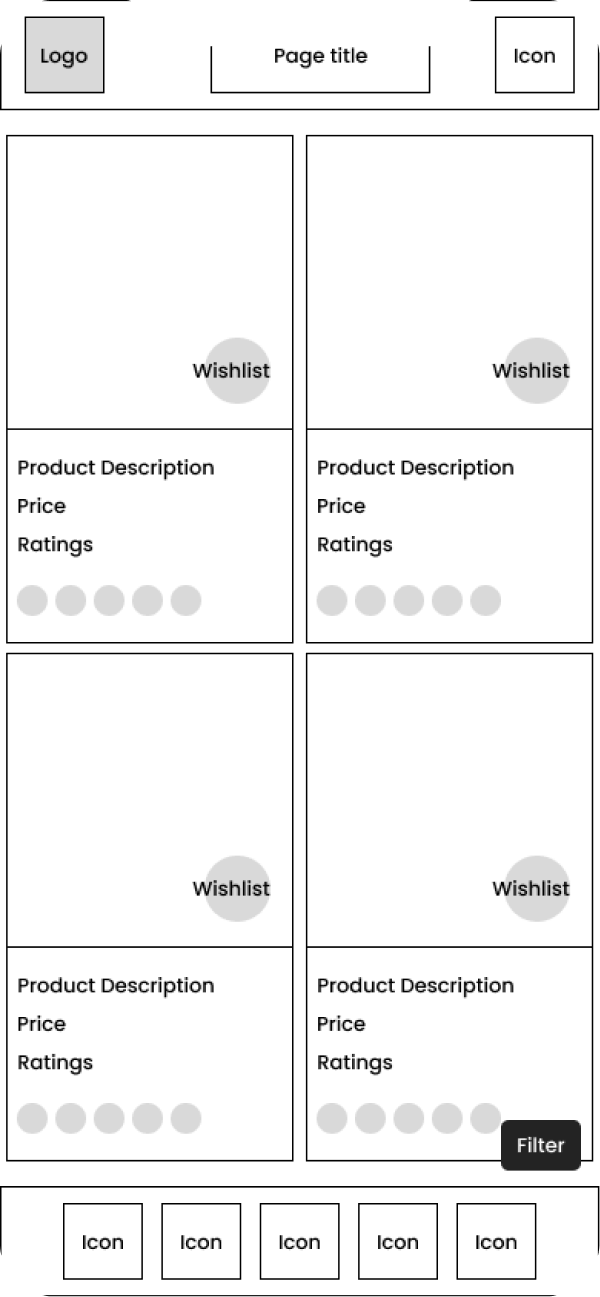
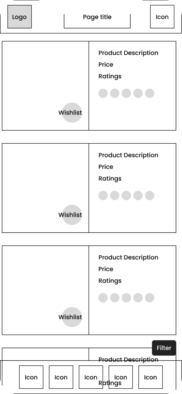
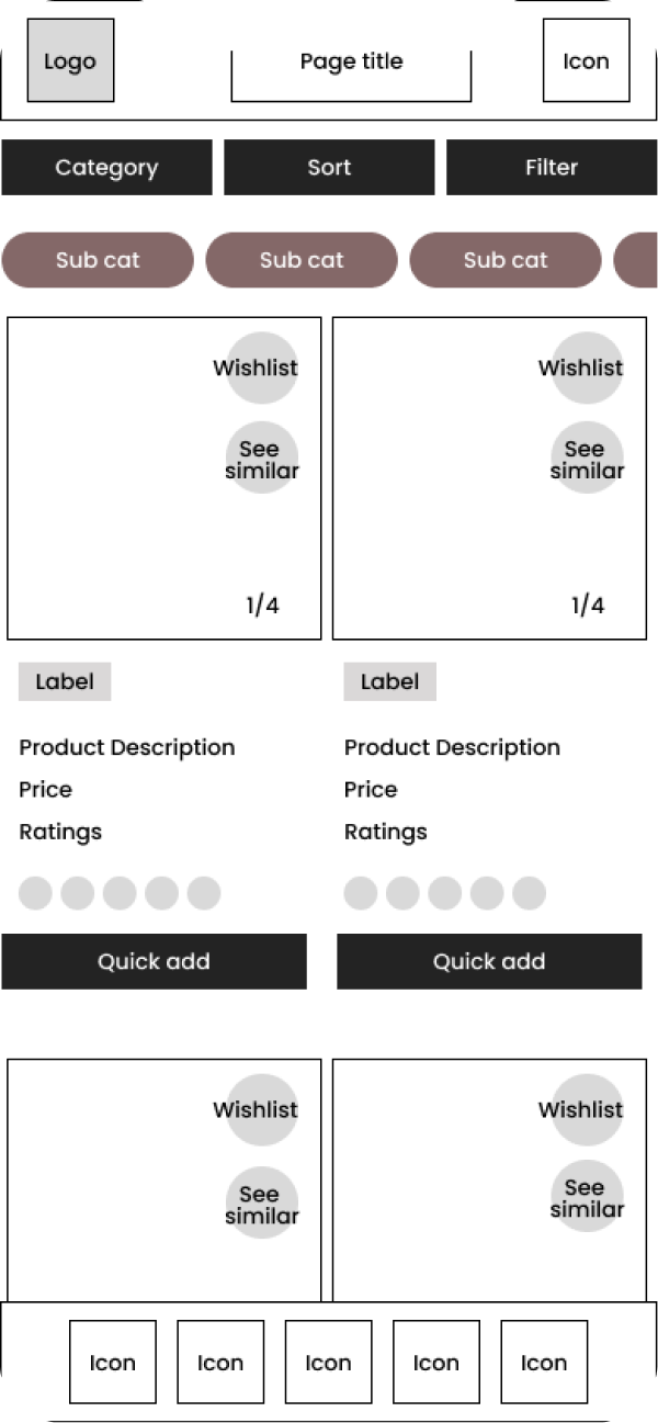
Lo-Fidelity Wireframes
Product Listing Page
Filter Panel
Quick Add
See Similar
Browse Flow
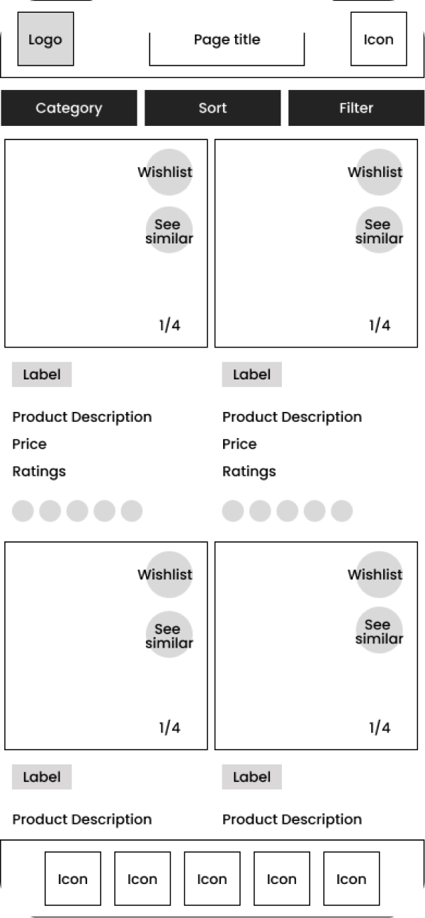
Category Navigation
User Testing
Moderated usability testing conducted with 8 mobile users based across Australia — covering browsing, filtering, wishlist, and purchase flows across the redesigned PLP.
Method
Moderated usability testing (mobile device, think-aloud protocol)
Participants
8 mobile users based across Australia — mix of regular Target app shoppers and infrequent users
Duration
45 minutes per session
Tasks
- 01
Browse the product listing page and find an item you'd consider buying
- 02
Use the filter options to narrow results down to a specific size and colour
- 03
Add a product directly to cart from the listing without tapping into the product detail page
- 04
Use the See Similar feature to discover a related product
- 05
Save an item to your wishlist, then navigate away and return to it
Testing Feedback
Findings from 8 moderated mobile sessions — patterns that directly influenced the filter simplification, card sizing, image swipe, and See Similar interactions in the final build.
What Worked
Users liked filtering by multiple criteria — colour, size, ratings — without leaving the listing page
Larger product cards gave users a better view of items, helping them shortlist faster at listing level
Swiping through product images on the listing card was immediately intuitive — adopted by all participants without prompting
See Similar surfaced adjacent products users hadn't considered — rated as one of the most useful additions in the session
What Needed Work
Too many visible filter options made it hard to focus — users defaulted to ignoring the panel rather than engaging with it
The slide-out filter entry point wasn't always easy to locate — placement needed to be more visually prominent
Some users felt overwhelmed by the number of swipeable images per card — a curated cap on assets per listing was recommended
Price comparison across similar products on the listing was absent — users wanted to scan relative pricing without tapping into each item
Key Insight
The filter panel was designed to be comprehensive, but users needed it to be decisive. The most effective filters — size and price — were buried under less-used options. Simplifying the initial view to two or three high-impact criteria resolved the friction immediately in follow-up testing.
Detailed Design
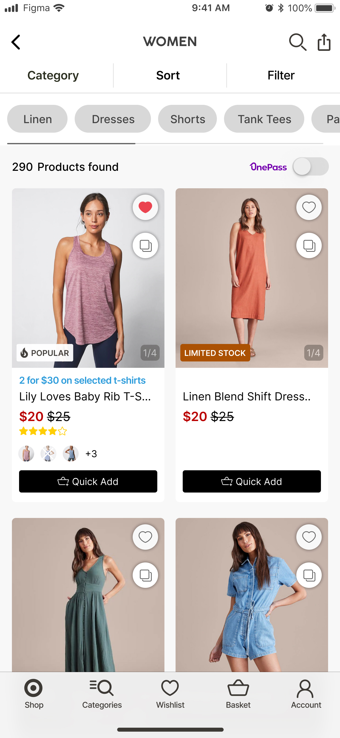
Four high-fidelity screens from the final build — all shipped, tested in production, and deployed to the Target Australia app.
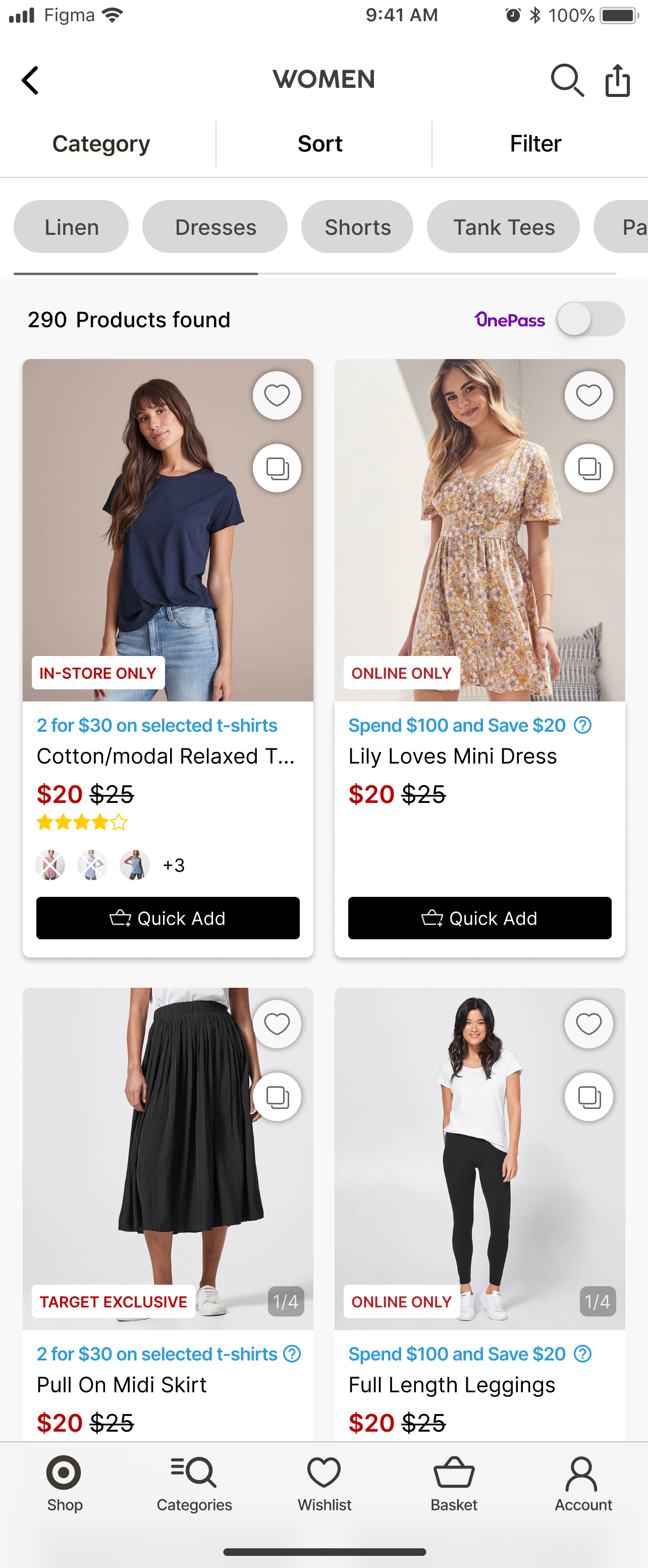
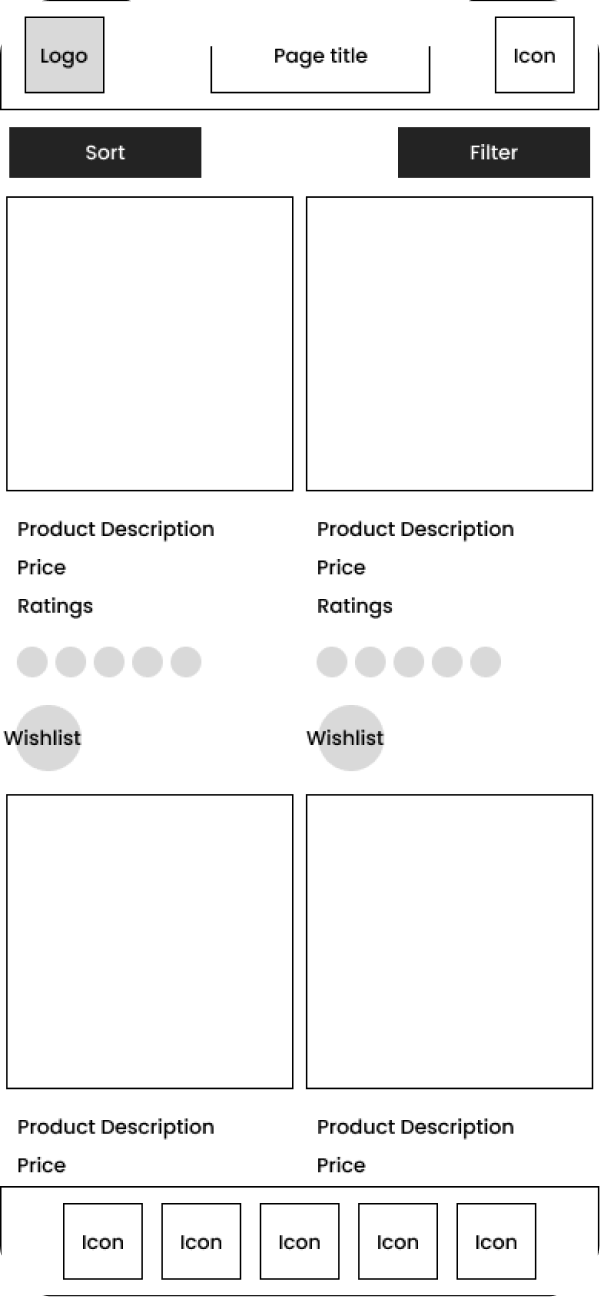
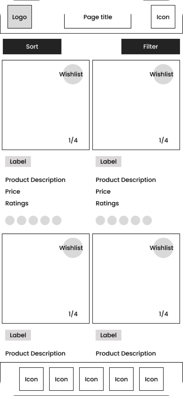
Product Listing Page
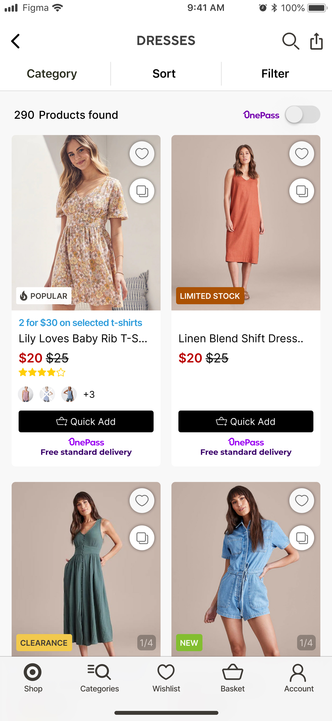
Redesigned grid with larger cards, colour swatches, deal labels, and rating visibility. Quick Add surfaced as a primary affordance on each card.
Filter Panel
Slide-out filter with simplified top-level options. Size and price defaulted above the fold — advanced filters accessible below.
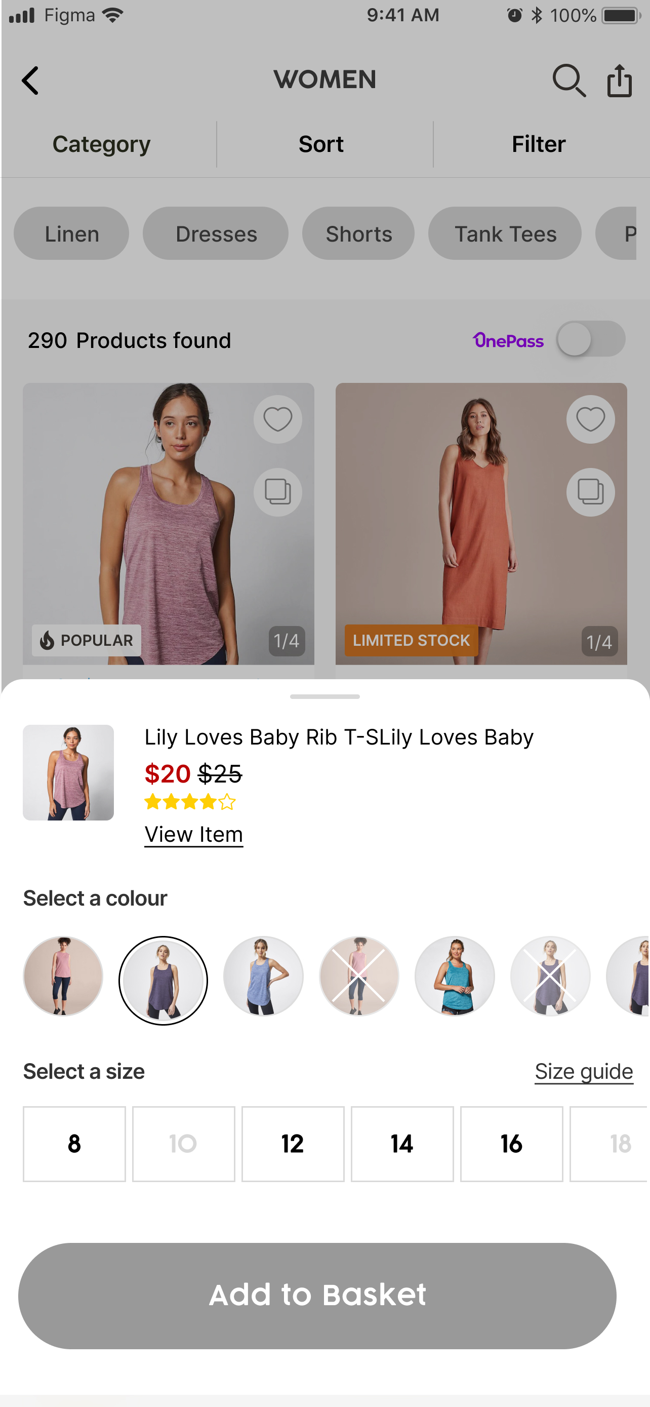
Quick Add
A size selector opens directly over the listing card — cart without leaving the PLP. Single-tap from browse to basket.
See Similar
Related products surface inline on the PLP — contextual discovery without a separate search or navigation step.
Design Strengths
Larger cards with swipeable images reduced the need to tap into PDPs — product quality assessable at listing level
Quick Add eliminated the main conversion barrier — users could go from browsing to cart in a single interaction
See Similar turned the PLP into a discovery layer — adjacent products surfaced at the moment users were already in browse mode
Colour swatches and deal labels at listing level gave users the context needed to shortlist without clicking through
All five new features shipped and deployed — validated with the product and engineering team within the agreed scope
Open Considerations
Filter simplification resulted in a two-tier pattern (primary + advanced) — secondary tier needs post-launch discoverability monitoring
Image swiping on listing cards increases asset load per page — performance on lower-end Android devices needs tracking
See Similar depends on a recommendation engine — the logic quality determines the feature's perceived value in production
Price comparison across listing cards remains an open gap — addressed in the brief for the next PLP iteration
Next Case Study