The Brief
What
Target Australia's app and website had no way for customers to assemble a complete outfit in one place. Shoppers navigated across separate category silos — tops, bottoms, shoes, accessories — and mentally pieced together a look without any editorial guidance or a way to see how pieces worked together. The brief was to design a 'Create a Look' feature that lets customers build, visualise, and purchase complete styled outfits from a single entry point, across both the mobile app and a parallel desktop web experience for Kids.
User
Target shoppers who want to buy complete outfits, not just individual items — but get stuck navigating across separate categories with no coordinated view of how pieces work together. The feature was designed mobile-first, with a parallel desktop web flow for the Kids clothing range.
Potential Challenges
Target's product structure had no integration between clothing types — tops, bottoms, shoes, and accessories lived in entirely separate category silos
Linking complementary items across categories required backend product data connections that weren't yet in place at design time
Limited design and development capacity constrained the scope of what the initial feature could deliver
The existing site structure didn't surface or guide users toward complete looks — discovery was category-first, not outfit-first
The feature needed to serve multiple audience segments — Women, Men, Kids, Baby, and Home — each with different styling logic and product ranges
Objectives & Goals
Give customers a single place to build and visualise a complete look — removing the cross-category navigation that caused drop-off.
Reduce decision fatigue by surfacing pre-curated looks that users can adopt wholesale or customise to their own preferences.
Drive additional item purchases by making it easy to add complementary pieces — shoes, accessories, jackets — within the same look-building flow.
Surface underexposed seasonal products through curated looks, increasing their visibility without requiring a dedicated marketing campaign.
Lay the groundwork for personalisation by letting customers save and revisit their own curated looks across sessions.
User Needs
Browse and purchase a complete styled outfit from a single location — not across fragmented category pages
Outfit recommendations that match their style without requiring manual cross-referencing between categories
Time savings — finding a coordinated look in one session rather than across multiple browsing trips
Discovery of complementary items — accessories, shoes, layering pieces — they may not have thought to include
High-quality imagery that shows how products look together in real-life styling contexts
Visibility of any bundled value — promotions or coordinated pricing that rewards buying the complete look
Key Questions
- 01
When you're shopping for clothes online, do you usually shop for a specific item or a complete outfit?
- 02
How do you currently figure out what goes with something you like — do you rely on the site, social media, or your own judgment?
- 03
If you found a curated look you liked, would you buy the whole outfit at once, or pick and choose individual pieces?
- 04
Walk me through how you'd find a complete outfit on the Target app right now. What's frustrating about that process?
- 05
How important is it to see how shoes and accessories fit into the look — or do you usually add those separately?
- 06
If a feature let you save a look and come back to it later, would you use that? What would make you return?
- 07
What would make you confident enough to add all items from a curated look to your cart in one go?
Competitor Analysis
Four retailers with active outfit curation or 'shop the look' mechanics were benchmarked — mapping what was table stakes and where a differentiated approach could win.
ASOS
Global FashionStrengths
Looks are tailored to user preferences based on browsing history — personalisation starts before the user has searched for anything
Visual-first layout with looks organised by theme (casual, formal, seasonal), each linked through to individual product pages
Weaknesses
Customising individual pieces within a curated look is limited — users must exit the look view to browse alternatives
Feature depth doesn't extend well to non-fashion categories like homewares or accessories
Takeaway
Theme-based organisation (by occasion or season) maps directly to how customers think about getting dressed — adopted as the core navigation model for the Style Me feature.
Nordstrom
Department StoreStrengths
Lifestyle imagery shows colour variants for each item without leaving the look view
Complementary items — shoes, accessories, jackets — are surfaced within the look, not just the hero pieces
Multi-item Add to Cart reduces purchase friction — the full look adds to bag in a single action
Weaknesses
Look curation skews premium — not representative of the range a mass-market retailer needs to cover
Mobile experience lags desktop — look browsing is less fluid on smaller screens
Takeaway
Multi-item 'Add All to Cart' is the single highest-impact interaction for look-based shopping — directly adopted as the primary purchase CTA in Target's flow.
Zara
High Street FashionStrengths
Minimalist editorial approach — curated looks appear directly on product pages, linking all visible pieces together
Fashion-forward, trend-led curation makes looks feel current and aspirational rather than basic
Weaknesses
Look customisation is absent — users can view the outfit but cannot swap individual pieces
Navigation between look and individual product is non-linear — easy to lose your place in the outfit
Takeaway
Editorial quality in look imagery sets the aspiration bar — product photography and curation quality directly influence how the feature is perceived, not just how it functions.
H&M
High Street FashionStrengths
Pre-styled outfits across occasions — one-stop browsing for coordinated looks without needing to navigate categories
Clear labelled navigation with one-click add for all items in a look
Weaknesses
Look discovery is buried within category navigation — not surfaced as a primary entry point from the homepage
Outfit variety doesn't always extend to different body types or sizing ranges
Takeaway
Surfacing the feature from the homepage — not buried in category navigation — is critical for adoption. The Style Me tile on Target's homepage was a direct design response to this finding.
Key Insights
Theme-based curation (by occasion or season) aligns with how customers think about getting dressed — category-first navigation works against them
Multi-item 'Add All to Cart' is the highest-impact purchase mechanic for look-based shopping — friction elimination at the moment of decision
Homepage entry point visibility is the difference between feature discovery and abandonment — buried navigation kills adoption
Editorial photography quality sets the perceived value of the feature — look images shape user trust before the first interaction
Journey Flow
Mapping the end-to-end flow from the app homepage through to checkout — tracing how a customer discovers the Style Me feature and builds a complete look piece by piece.
App Homepage
Style Me
Browse curated looks by category — Women, Men, Kids, Baby, Home
Create a Look
Select items for each part of the outfit: Tops, Bottoms, Shoes, Jackets — all from one screen
From the Dashboard
Add to Look
Add individual items to your current look one by one
Add All to Cart
Add the full outfit to your cart in a single action
Your Look
Review your saved look — swap pieces or proceed to checkout
Quick Add
Add a single item to cart without building the full look
Size Selection
Confirm your size per item — inline within the look flow, no PDP navigation required
Complete look added to cart — via Add All to Cart or individual item selection — and checkout completed
Solution
Key features in scope
Lo-Fidelity Wireframes
Homepage — Style Me Tile
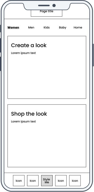
Style Me — Category Select
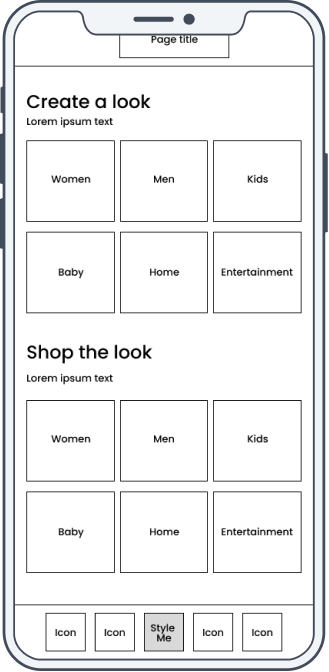
Create a Look — Browse
User Testing
Moderated usability testing with 8 mobile users across Australia — covering look discovery, item selection, size confirmation, and the checkout flow.
Method
Moderated usability testing (mobile device, think-aloud protocol)
Participants
8 mobile users based across Australia — Target customers of varying shopping frequency and familiarity with the app
Duration
45 minutes per session
Tasks
- 01
Find the 'Create a Look' feature starting from the app homepage
- 02
Browse the curated looks in the Women's category and find one you'd wear
- 03
Add all items from a curated look to your cart in one action
- 04
Select your size for a specific item within the look before adding to cart
- 05
Review your saved look and navigate through to checkout
Testing Feedback
Findings from 8 moderated sessions — patterns that directly shaped the size selection placement, look navigation, and the 'Add All to Cart' CTA in the delivered designs.
What Worked
The flow from homepage to Style Me was immediately intuitive — all participants found the entry point without any guidance
Themed looks (e.g. 'Dinner Party', 'Weekend Casual') made shopping for specific occasions effortless and genuinely inspiring
Add All to Cart was the standout feature — participants called it out as the most time-saving part of the experience
The category tab navigation (Tops, Bottoms, Shoes, Jackets) made outfit building feel structured without feeling rigid
What Needed Work
Product detail — fabric composition, sizing notes, care information — was missing from item cards within the look view, causing hesitation before adding
Users wanted to mix and match individual pieces from different curated looks — the fixed look structure felt limiting once they'd found a starting point
Size selection appeared too late in the flow — participants wanted to set their size at the start, not at the point of adding an item
Re-entering a previously browsed look required starting from the beginning — a persistent saved look state would have reduced friction significantly
Key Insight
Users trusted the curated look as a starting point but wanted editorial control from that point forward. The ability to swap a single piece — keeping the rest of the look intact — was the single most-requested refinement after testing, and was scoped as a priority for the next iteration.
Detailed Design
Four high-fidelity mobile screens covering the core look discovery and build journey — from homepage entry to adding items to basket. Handed off to the app and web product squads for scoping and backlog integration.
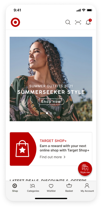
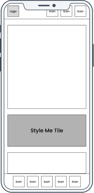
Homepage
Style Me tile surfaced as a primary homepage feature — discoverable without navigating into any category menus.
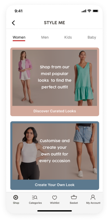
Style Me
'Shop from our most popular looks to find the perfect outfit' — editorial positioning that frames the feature as curation, not just browsing.
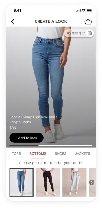
Create a Look — Bottoms
Category tabs (Tops, Bottoms, Shoes, Jackets) let users build the look piece by piece from a single screen — no cross-category navigation required.
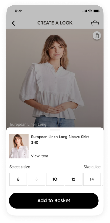
Add to Basket
Inline size selection and Add to Basket — triggered from within the look view. Users confirm size and add to cart without leaving the look flow.
Design Strengths
Homepage Style Me tile drove passive feature discovery — users found it without knowing it existed before the session
Themed category navigation made outfit building feel editorial and aspirational rather than transactional
Add All to Cart eliminated the primary friction point in multi-item shopping — one action from look to basket
Inline size selection kept users within the look flow — no PDP navigation required to confirm a size and add an item
Desktop web flow designed in parallel for the Kids range — both mobile and web handed off together for squad integration
Open Considerations
Piece-swapping within a look (mix-and-match) was the most-requested capability after testing — deferred to the next design iteration
Product detail surfacing on look item cards (fabric, sizing notes) remains an open gap — raised during testing, not resolved in the initial handoff
Size selection placement needs revisiting — users want to set their size at look entry, not per-item at the point of add to cart
Personalised look recommendations based on purchase history were scoped as a future enhancement — not included in the initial handoff
Designs cover the full mobile look-building journey and a parallel desktop web flow for the Kids range. Handed off to the app and web product squads for scoping, prioritisation, and backlog integration.
Next Case Study